'That is why no amount of cajolery, and no attempts at ethical or social seduction, can eradicate from my heart a deep burning hatred for the Tory Party.... So far as I am concerned they are lower than vermin'
In baseball, they often have a retro round, where the teams deck themselves out in the uniforms from eras gone by. That would be an interesting idea for Magic, where the RFL designate a year or decade, and the teams have to do a modern version of that. Could see some classic old shirts (and some horrors).
Even better if they somehow dug out the actual old shirts. The 1989/90(?) British Coal top was the best kit of any sporting team I've ever seen. Wish I'd kept it
Even better if they somehow dug out the actual old shirts. The 1989/90(?) British Coal top was the best kit of any sporting team I've ever seen. Wish I'd kept it
Really!
I thought it was dreadful still do, but it’s all about opinion.
That said best team kit ever, I take it you’re joking, or I’m going to send round the men in white coats.
Even better if they somehow dug out the actual old shirts. The 1989/90(?) British Coal top was the best kit of any sporting team I've ever seen. Wish I'd kept it
Which one do you mean? We had a few British Coal ones.
The red one with lightening strike and white shoulders The white one with red bands like the tradition one The blue one like 79 Wembley but with fancy bits on the band, we wore in Yorkshire cup win. Or the blue one with red and white stripes on shoulders like we wore in 90 Yorkshire cup against Cas.
I quite liked all of them.
Part of the opinion of how good they were comes down to who wore them too.
For "best" shirts, you cant go too far wrong with the white shire with red and blue horizontal hoops and the away shirt, blue with red and white horizontal hoops of the Toppo era, timeless classics.
For "best" shirts, you cant go too far wrong with the white shire with red and blue horizontal hoops and the away shirt, blue with red and white horizontal hoops of the Toppo era, timeless classics.
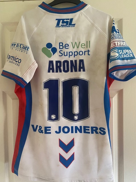
Classic. Still have that one and the 91 shirts - the blue home (similar to this one) and the red away one. I had the white 1989 one too, but as some know on here I swapped it at the Hudds away game with Tini for his last shirt (my avatar) we had one of these as a magic shirt a few years ago if memory serves??? Anyway, back on topic, the new one is OK, but I wouldn't buy it
wrencat1873 wrote:
For "best" shirts, you cant go too far wrong with the white shire with red and blue horizontal hoops and the away shirt, blue with red and white horizontal hoops of the Toppo era, timeless classics.
Classic. Still have that one and the 91 shirts - the blue home (similar to this one) and the red away one. I had the white 1989 one too, but as some know on here I swapped it at the Hudds away game with Tini for his last shirt (my avatar) we had one of these as a magic shirt a few years ago if memory serves??? Anyway, back on topic, the new one is OK, but I wouldn't buy it
We’ve revamped and reinvented just about every one of the old traditional designs except maybe the white shirt with the ‘W’ in red & blue on the front. I’m sure there’s a way in which that shirt could be made to look good
For "best" shirts, you cant go too far wrong with the white shire with red and blue horizontal hoops and the away shirt, blue with red and white horizontal hoops of the Toppo era, timeless classics.
This shirt is probably the worst we've ever done. The reissue is the only Magic shirt I've not purchased.
wrencat1873 wrote:
For "best" shirts, you cant go too far wrong with the white shire with red and blue horizontal hoops and the away shirt, blue with red and white horizontal hoops of the Toppo era, timeless classics.


