|
 |
| Rank | Posts | Team |
| Club Coach | 2935 | No
Team
Selected |
| Joined | Service | Reputation |
| Feb 2005 | 20 years | |
| Online | Last Post | Last Page |
| Jul 2021 | Nov 2012 | LINK |
| Milestone Posts |
|
| Milestone Years |
|
|
| Location |
|
| Signature |
|
TO BE FIXED |
|
| I know its a bit early for this sort of thing but I was a bit bored and playing around on photoshop and came up with this based on what i'd like to see next time around.
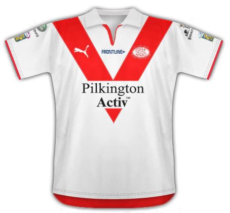
What sort of things would others like to see design wise from next season's kits? |
|
|
| Rank | Posts | Team |
| International Chairman | 4096 | Doncaster RLFC |
| Joined | Service | Reputation |
| Oct 2002 | 23 years | |
| Online | Last Post | Last Page |
| Jul 2018 | Nov 2016 | LINK |
| Milestone Posts |
|
| Milestone Years |
|
|
| Location |
|
| Signature |
|
TO BE FIXED |
|
| Good effort. Would prefer it without a collar, Ive always thought we are playing rugby not going to a board meeting.  |
|
|
|
|
| Rank | Posts | Team |
| International Chairman | 11377 | St. Helens |
| Joined | Service | Reputation |
| Sep 2002 | 23 years | |
| Online | Last Post | Last Page |
| Jan 2025 | Aug 2024 | LINK |
| Milestone Posts |
|
| Milestone Years |
|
|
| Location |
|
| Signature |
|
TO BE FIXED |
|
| Quote St Ty="St Ty"I know its a bit early for this sort of thing but I was a bit bored and playing around on photoshop and came up with this based on what i'd like to see next time around.

What sort of things would others like to see design wise from next season's kits?'"
That would be the best shirt we've had in years |
|
|
| Rank | Posts | Team |
| Club Owner | 14135 | No
Team
Selected |
| Joined | Service | Reputation |
| Oct 2004 | 21 years | |
| Online | Last Post | Last Page |
| Apr 2019 | Apr 2019 | LINK |
| Milestone Posts |
|
| Milestone Years |
|
|
| Location |
|
| Signature |
|
TO BE FIXED |
|
|
Despite being a Wigan fan, I really like this season's kit of yours, as it's a similar design to the one you had the first season I really got into watching rugby league in the mid 1980s.
For me, Saints kits 'should' be one of the best out there, but for some reason your designers can't seem to get good proportions on the design. 3 years ago, for instance, you had a V that was too thick and very low in positioning, meaning the sponsor was on the belly button.
The season's after, the V looked like an afterthought, tacked onto a ready made design, and had the added effect of making the players look fat and out of shape (when they clearly weren't!), whilst the red collar made the players look like they were wearing dickie bows. Last season, the V was so shallow, it may have been the pre 1960s band. The black version, however, looked great.
Supposedly, the V was originally popular on rugby kits as it is supposed to make the player look bigger around the upper body, but you have to get the proportions right. St George, and Warrington last year are good examples, for instance.
|
|
|
| Rank | Posts | Team |
| Club Owner | 14135 | No
Team
Selected |
| Joined | Service | Reputation |
| Oct 2004 | 21 years | |
| Online | Last Post | Last Page |
| Apr 2019 | Apr 2019 | LINK |
| Milestone Posts |
|
| Milestone Years |
|
|
| Location |
|
| Signature |
|
TO BE FIXED |
|
|
My opinion on the above design - great, but would look better without the triangle under the sponsor.
|
|
|
|
|
| Rank | Posts | Team |
| Player Coach | 7069 | No
Team
Selected |
| Joined | Service | Reputation |
| Jan 2006 | 19 years | |
| Online | Last Post | Last Page |
| Sep 2014 | Sep 2014 | LINK |
| Milestone Posts |
|
| Milestone Years |
|
|
| Location |
|
| Signature |
|
TO BE FIXED |
|
|
It needs some piping or something on the side.
As much as i like a plain white with red vee kit they usually have something else on them.
Oh, and can we move frontline from the centre to the side of the vee.
|
|
|
| Rank | Posts | Team |
| International Chairman | 1488 | No
Team
Selected |
| Joined | Service | Reputation |
| Jun 2002 | 23 years | |
| Online | Last Post | Last Page |
| May 2012 | Apr 2012 | LINK |
| Milestone Posts |
|
| Milestone Years |
|
|
| Location |
|
| Signature |
|
TO BE FIXED |
|
|
Looks very good to me. Well done
|
|
|
| Rank | Posts | Team |
| Club Coach | 31335 | No
Team
Selected |
| Joined | Service | Reputation |
| May 2005 | 20 years | |
| Online | Last Post | Last Page |
| Jan 2015 | Nov 2014 | LINK |
| Milestone Posts |
|
| Milestone Years |
|
|
| Location |
|
| Signature |
|
TO BE FIXED |
|
|
That, is, awesome.
Get on the blower to Tony Colquitt.
GET IT DONE!
|
|
|
|
|
| Rank | Posts | Team |
| Player Coach | 26 | No
Team
Selected |
| Joined | Service | Reputation |
| Jan 2008 | 17 years | |
| Online | Last Post | Last Page |
| Oct 2010 | Mar 2010 | LINK |
| Milestone Posts |
|
| Milestone Years |
|
|
| Location |
|
| Signature |
|
TO BE FIXED |
|
| I can see where you got your inspiration from -

I have always wanted a St George kit but couldn't bring myself to wear a red vee on my chest |
|
|
| Rank | Posts | Team |
| Player Coach | 12189 | No
Team
Selected |
| Joined | Service | Reputation |
| Jun 2007 | 18 years | |
| Online | Last Post | Last Page |
| Jun 2017 | May 2017 | LINK |
| Milestone Posts |
|
| Milestone Years |
|
|
| Location |
|
| Signature |
|
TO BE FIXED |
|
|
|
|
|
| Rank | Posts | Team |
| Player Coach | 299 | No
Team
Selected |
| Joined | Service | Reputation |
| Mar 2009 | 16 years | |
| Online | Last Post | Last Page |
| Jun 2010 | Dec 2009 | LINK |
| Milestone Posts |
|
| Milestone Years |
|
|
| Location |
|
| Signature |
|
TO BE FIXED |
|
| Quote stey_06="stey_06"I can see where you got your inspiration from -

I have always wanted a St George kit but couldn't bring myself to wear a red vee on my chest'"
Wear it under your normal shirt.
It would be your little secret then   |
|
|
|
| Rank | Posts | Team |
| International Chairman | 23553 | No
Team
Selected |
| Joined | Service | Reputation |
| Oct 2002 | 23 years | |
| Online | Last Post | Last Page |
| Sep 2014 | Mar 2014 | LINK |
| Milestone Posts |
|
| Milestone Years |
|
|
| Location |
|
| Signature |
|
TO BE FIXED |
|
| Quote St Ty="St Ty"I know its a bit early for this sort of thing but I was a bit bored and playing around on photoshop and came up with this based on what i'd like to see next time around.

What sort of things would others like to see design wise from next season's kits?'"
Its beautiull. Do it in blue ( light and dark ) to please 
Ooooooooooo sexxxxxyyyyyyyyyy |
|
|

 |
|